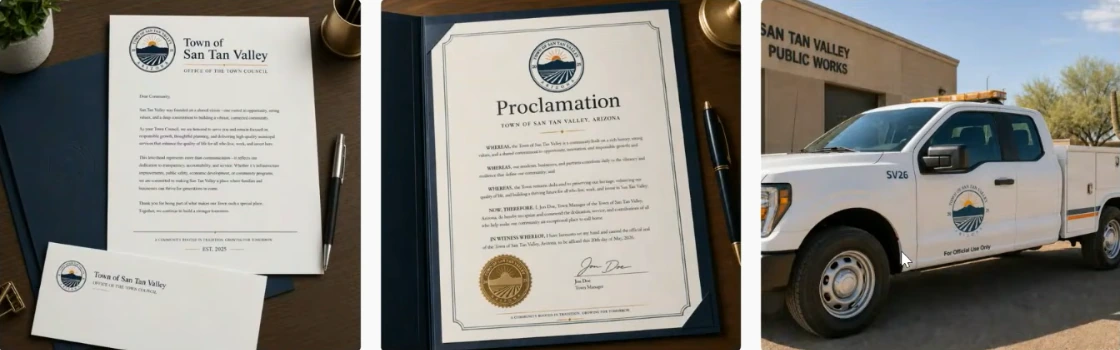
SAN TAN VALLEY, AZ — The San Tan Valley Town Council advanced Package One, the design with the V, as its preferred finalist for further consideration in the San Tan Valley logo design competition on June 3, 2026.
However, the vote does not name an official winner. The contest, launched in January with a $2,500 prize for residents, drew 175 designs from 66 entrants and was narrowed to five finalists on May 6 and then to two on May 20. From those two, Council picked Package One on June 3. The chosen package now goes to graphic designers at the Maricopa Association of Governments, or a qualified design firm, for refinement before Council considers final adoption on June 17. San Tan Valley recently joined MAG, the regional planning organization. The logo could still change before residents see it on Town vehicles, signage, websites, and apparel.
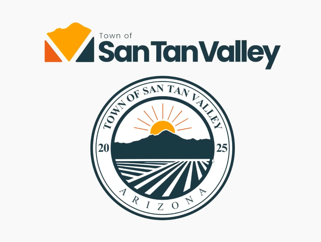
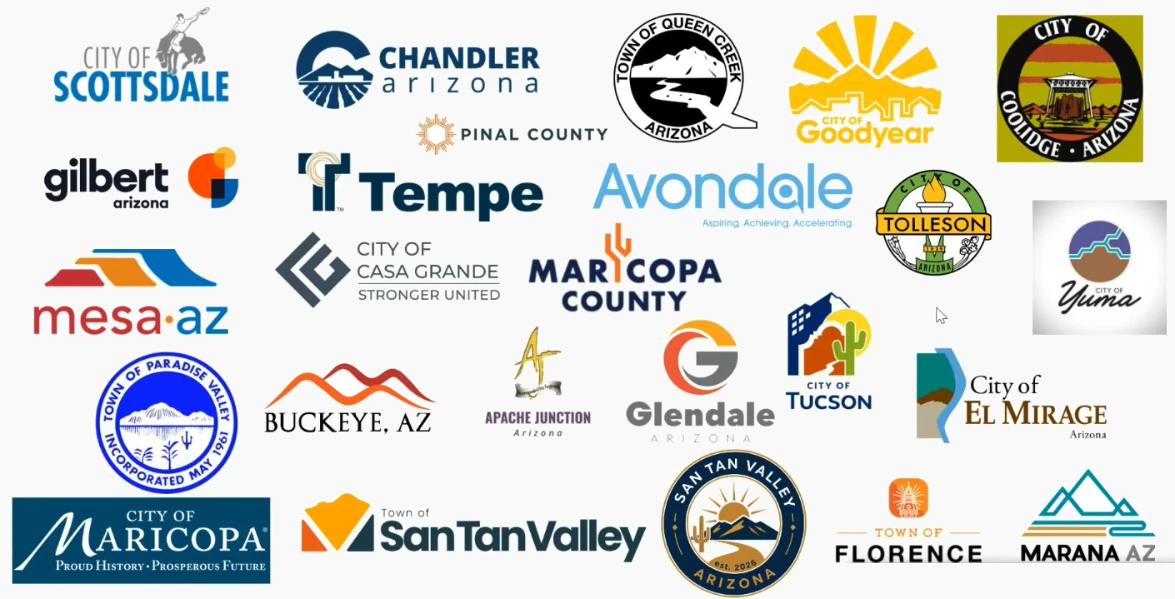
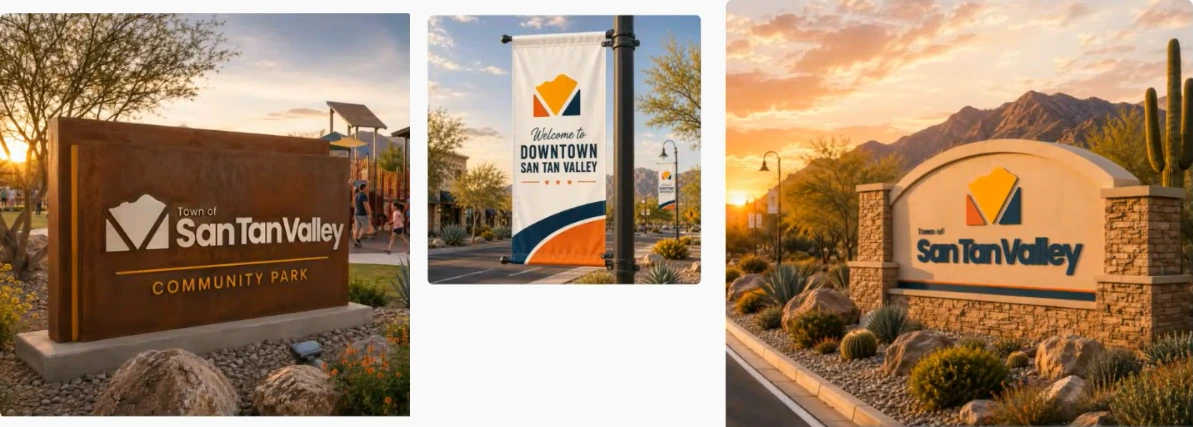
Package One uses a stylized mountain silhouette, an upward path representing Hunt Highway, and a subtle “V” monogram for San Tan Valley.

Human Resources Director Janet Dayer told Council the eventual logo will appear across many Town surfaces, and must scale from a USB drive to apparel such as a hat without losing detail. She warned that frequent changes can confuse residents, weaken brand recognition, drive up replacement costs, and erode the Town’s overall identity. That risk, she said, is why staff and Council are taking a deliberate, multi-meeting approach.
The Reasoning Behind Package One
Dayer told Council the Package One designer had developed a full branding package. Using Canva as the primary design platform, the designer built the logo mark, font, layout, color, and a brand guide. By contrast, Dayer’s description of Package Two listed individual design elements added through revision, but did not include a brand guide. Earlier in her presentation, she had laid out the criteria for an effective town logo: simple, distinctive, scalable, and limited to two or three colors, with complex designs often failing because they don’t scale and become unrecognizable. Town Manager Brent Billingsley added that a logo also needs to translate cleanly to printed paper, stitching on a hat, and vinyl applied to a vehicle door, which ruled out gradients and layered colors.
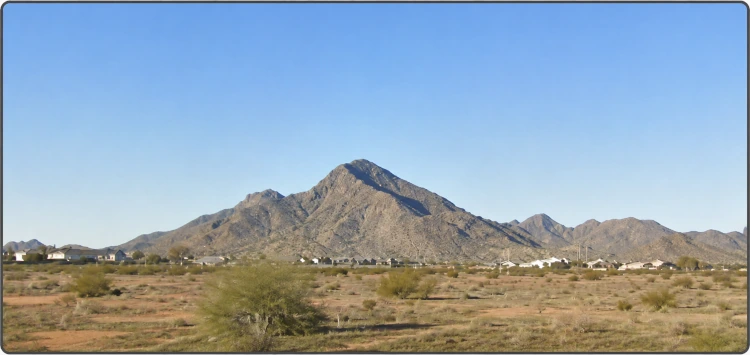
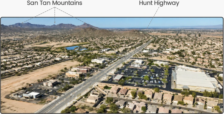
Councilmember Rupert Wolfert read the Package One designer’s stated reasoning into the record. According to the designer’s notes, the three elements were chosen to anchor the design in landmarks residents recognize from daily life. The mountain represents Goldmine Mountain, “the landmark that defines the valley and gives residents an immediate sense of place.” The upward path represents Hunt Highway, which the designer described as “the path that many residents travel each day” as they leave for opportunity and return home to family. The “V” ties the symbol to the town’s name.
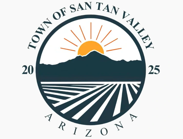
Package One also includes a new official seal, added for the June 3 presentation. Council had given the designer feedback at the May 20 meeting to provide a seal that matched the rest of the branding package. The result is a circular seal with an orange sun rising behind a dark blue mountain silhouette, striped fields below, and “TOWN OF SAN TAN VALLEY ARIZONA 2025” running around the outer ring.
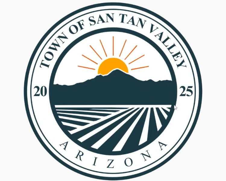
The designer provided both a main seal and a simplified version. Vice Mayor Hudgins called the simplified version “really nice,” saying its minimalist treatment made it look more modern than traditional, dated municipal seals.
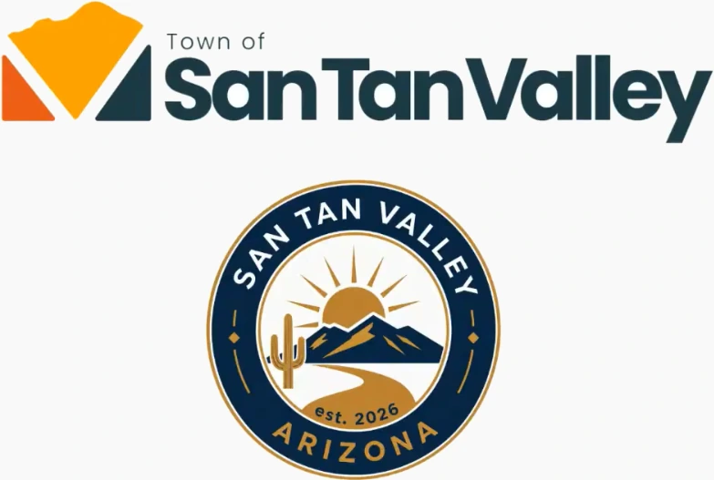
Councilmember Brian Tyler raised a concern about Package One’s newly added seal. He said it “mirrors Chandler’s” but lacked the narrative meaning Chandler’s seal carries about progressing from fields into a city.

In response, Dayer read from the designer’s notes: “The seal and logo were designed to serve different purposes while remaining connected through the same sense of place and community identity. San Tan mountain silhouette provides a recognizable visual anchor, desert-inspired colors reflect the surrounding landscape, and complementary topography balances tradition and modern.”
Concerns About Package Two and Generative AI
Vice Mayor Tyler Hudgins raised two concerns about Package Two. First, someone from Queen Creek contacted him to say the design resembled an updated Queen Creek Police Department logo. Second, the design was generated using ChatGPT and refined in Inkscape. “Honestly, that’s the issue with using ChatGPT to generate a logo. It’s drawing from other sources,” he said.
Hudgins also shared a personal reservation about the $2,500 prize. “I kinda have a moral dilemma personally with awarding a $2,500 check to somebody who’s used generative AI to develop a logo and bypassing that creative space,” he said. He acknowledged the contest rules did not prohibit AI use.
Councilmember Bryan Hunt added that the design felt generic. “I feel it’s cliché, the mountains, the sunset, the cactus,” he said. He noted the design lacked anything specific to San Tan Valley, saying it could be “any town in Arizona” if the town’s name were removed. Hunt added that any design featuring Hunt Highway had his support. The cliché concern echoed earlier feedback from Councilmember Daniel Oakes, who at the May 6 meeting said cactus, sun, and mountain imagery can feel cliché in Arizona logos.
Dayer said the two packages used artificial intelligence differently. According to her, the Package Two designer used ChatGPT and Inkscape for design creation, editing, and vector graphic conversions. By contrast, Dayer said the Package One designer used Canva as the primary design platform and used AI only for mockups showing how the design could appear on branded materials.
Comparing the San Tan Valley Logo to Neighboring Towns
Both finalists included brand-mark treatments alongside their primary logos. Package One’s brand mark is the V from the primary logo, presented on its own without the “San Tan Valley” wordmark. For the June 3 presentation, the Package Two designer added two new monogram treatments: a “SanTanValley” wordmark with stylized interlocking S, T, and V letters, and a separate STV monogram icon.
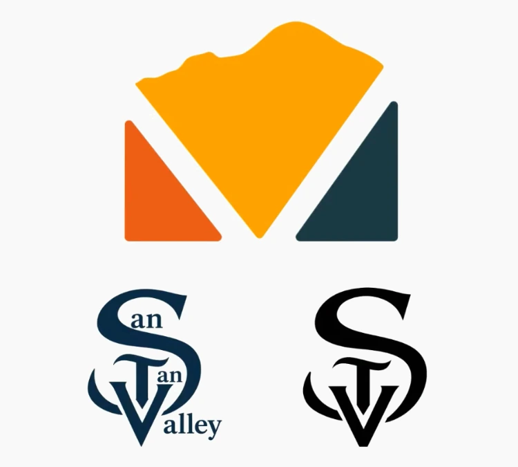
Councilmember Rupert Wolfert took issue with one of Package Two’s brand marks. “I’m not too fond of the insignia or logo from package two,” he said. “It just reminds me too much of like, the Seattle Kraken or something like that.”
Mayor Daren Schnepf, viewing the same Package Two marks earlier in the discussion, had suggested they could work for a future sports team. “That might not be bad when San Tan Valley gets the professional baseball team,” he said.
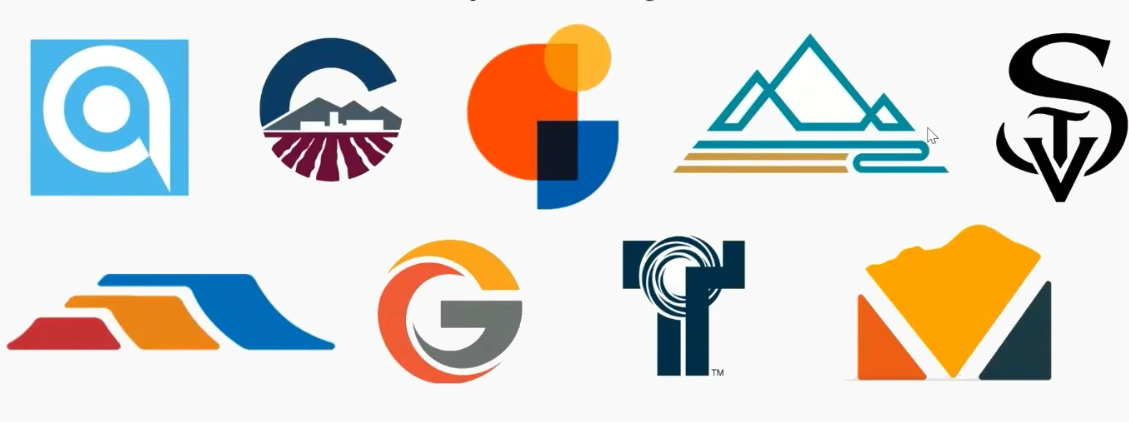
Dayer then placed the finalists in broader context. “I did add the top two, just so that you can see what it would look like amongst its peers,” she said.
The slide below compared brand marks alone: those of Avondale, Chandler, Gilbert, Marana, Mesa, Glendale, and Tempe, alongside the V monogram from Package One and the STV monogram from Package Two. Its message read: “Residents recognize it immediately, even when the full city name isn’t present.”
Another slide compared full logos, placing both finalist proposals among those of Scottsdale, Chandler, Queen Creek, Goodyear, Gilbert, Tempe, Avondale, Mesa, Glendale, Tucson, Maricopa, Florence, and Marana.
Why Professional Designers Are the Next Step
Council is not expected to consider final approval until after the Maricopa Association of Governments and/or a qualified design firm have refined the chosen package. Billingsley described MAG as the Metropolitan Planning Organization and Transportation Management Agency for central Arizona, and said the organization has graphic designers and contracted firms that have offered to help with the logo and branding effort. Mayor Schnepf added that San Tan Valley is now an official member of MAG, which is why those resources are available.
The refinement work will set the color palette, finalize typography, adjust layouts for digital, print, signage, fleet, apparel, and promotional materials, and create scalable formats that hold up across every application.
The Vote and Motion Language
Vice Mayor Hudgins moved to select Logo Package Number One as the preferred finalist. Councilmember Daniel Oakes seconded. The motion carried by majority.
“This action does not constitute final adoption of the town’s official logo or selection of a competition winner,” Hudgins said when reading the motion.
The Road to Operational Independence Day
Between June 4 and June 16, staff will coordinate with MAG and/or the design firm on the refinement work. The refined logo returns to Council on June 17, when members may take action to formally adopt the design and declare a competition winner.
If a winner is selected, the designer will be recognized and receive the prize check at a future Council meeting. Billingsley said the goal is to debut the final logo at the Town’s drone show on July 1, which is tied to San Tan Valley’s Operational Independence Day Celebration.


Put the Good Round Logo up that EVERYONE LOVES THIS ONE
https://www.facebook.com/photo.php?fbid=26889236547370476&type=3