SAN TAN VALLEY, AZ — San Tan Valley residents are one step closer to seeing their town’s first official municipal logo. On May 6, 2026, the San Tan Valley Town Council reviewed the top five finalists from the Town’s Logo Design Competition. Council members provided feedback to staff and may vote on a preferred design at the May 20 regular meeting. Under the competition framework approved in January, the winning designer stands to receive a $2,500 prize.
Whichever design the Council eventually adopts will represent the town across signage, vehicles, apparel, and official communications. For now, no winner has been chosen, and council members made clear they are not required to select any of the submitted designs.
Finalist Designs
Two designs tied for first place with 13 points each. The third-place design earned 10 points, the fourth-place entry received 9 points, and the fifth-place finalist finished with 7 points.
How the Town Logo Contest Selection Process Worked
The competition opened February 1 and closed May 1. It was open only to people living within town boundaries. A total of 66 individuals entered, producing 175 design variations, since many entrants submitted multiple concepts. Of those entrants, 11 were age 17 or under. To keep the review unbiased, staff anonymized every entry and assigned numerical identifiers.
Each council member independently picked a top five from the full field. On May 6, members viewed all entries in person at the San Tan Valley County Complex and submitted their ranking sheets. HR Director Janet Dayer then tabulated the results and presented the five finalists to the Council.
Branding Packets and Ownership
Town Manager Brent Billingsley explained that the two first-place finalists arrived with significantly more material than the other entries. According to him, both submissions included full branding packets with color variations, designated fonts, and layouts for memos and letters. He said those entrants are likely industry professionals.
By contrast, Billingsley said at least one other finalist appeared to be a logo submission rather than a full branding package. As a result, if the Council selects one of the simpler entries, the Town would hire a professional designer to develop fonts, color variants, and adaptations for vehicles, T-shirts, and flags. Dayer said staff will ask those entrants whether they can provide a fuller branding package as well.
Vice-Mayor Hudgins emphasized that the Town will retain full rights to the chosen artwork. “At the end of this process, we own all the art,” he said. He added that a professional design firm could later refine the logo while keeping its core elements intact, based on Council feedback. The Council established that ownership condition when it approved the competition framework in January.
Council Feedback and Possible Modifications
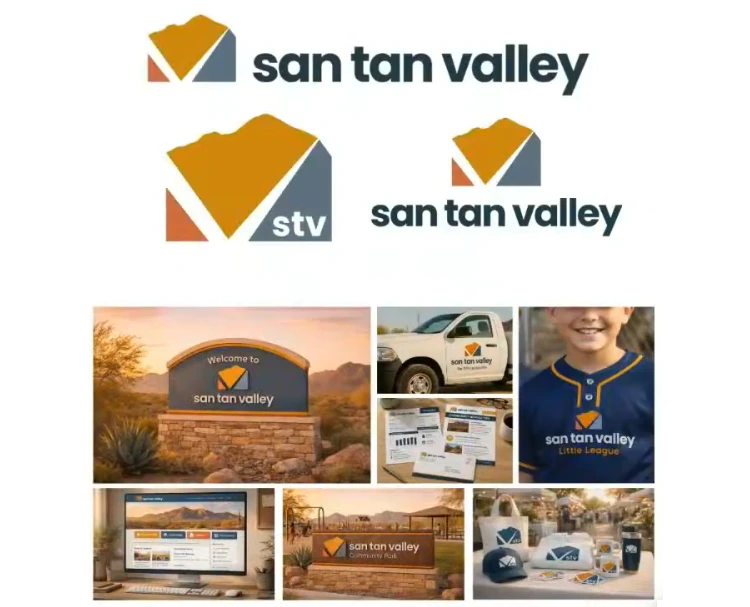
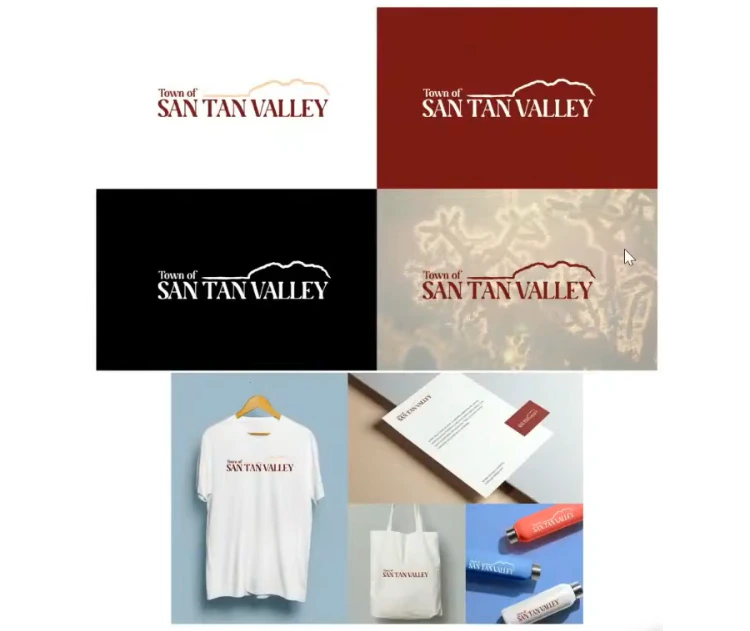
For the tied-first entry 22, which features a stylized “V,” Council Member Rupert Wolfert said the design “really hits simplicity, reproducibility” and would work on items like Town polos. He added that “the meaning is deeper with the V” and suggested the gray could be adjusted. Hudgins agreed, observing that the design “comes alive” on solid black or solid blue backgrounds but looks weaker on white. He offered his own reading of the V, saying it “feels like a change of direction with the incorporation, and our roads that are not so great.”
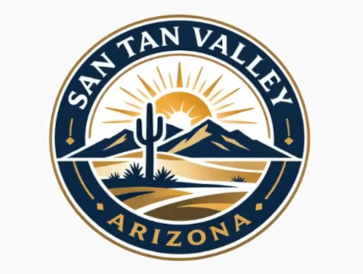
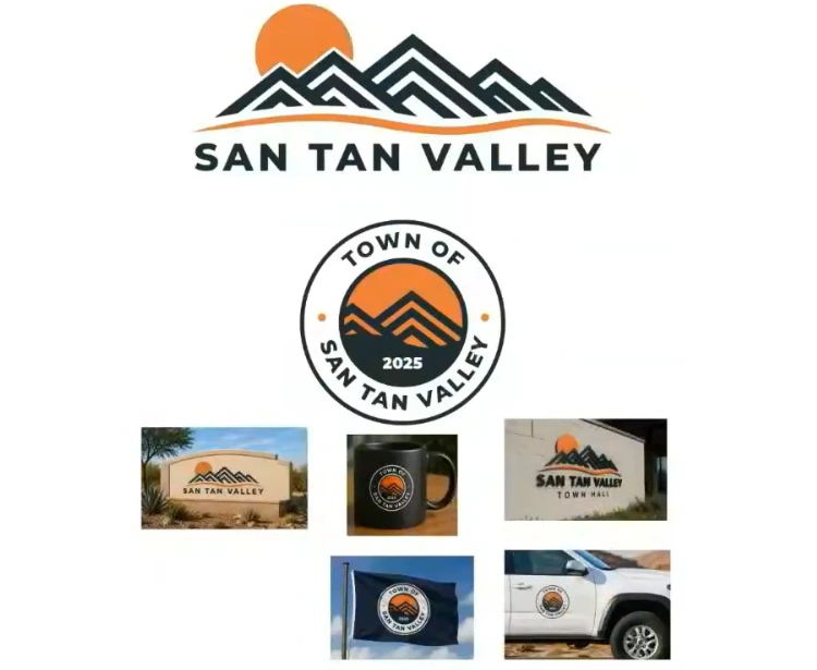
For the other tied-first entry, number 31, Mayor Schnepf said he would like to see a different color scheme on the orange tone. Hudgins, however, said the orange on entry 22 looked fine. Council members raised the possibility of providing color alternates across the logos for further review. Hudgins said he liked the wide horizontal version of entry 31, which features a mountain range alongside the words “San Tan Valley,” but felt the same design loses impact when condensed into the circular crest version. He said crests and circles feel “early 2000s” and suggested the design could work better as a different kind of emblem.
Council Member Gia Jenkins asked whether designers had submitted written meaning behind their colors and shapes. Dayer said some entrants had, though she could not recall which, and offered to include those explanations when she returns on May 20.
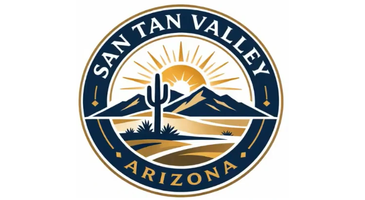
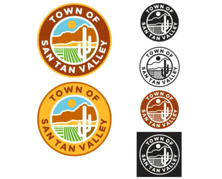
Council Member Daniel Oakes said cactus, sun, and mountain imagery can feel cliché in Arizona logos. He encouraged designs tied to recognizable local features and clear symbolic meaning. Mayor Schnepf also said the Town would need to do its due diligence to make sure the chosen logo does not have copyright conflicts with similar existing designs.
Schnepf reminded the room that none of the five must be selected. “This is a competition where we don’t have to pick any of them if we don’t want,” he said. “We have that caveat in the rules.”
What Comes Next for the Logo
Council members can submit additional written feedback to staff by Friday. Dayer will then work with the designers to refine the finalists.
On May 20, the Council is expected to see the top five again, with revisions where designers can accommodate them, and Dayer said members will then vote on one. After that, staff will work with the selected designer to finalize the artwork before bringing it back on June 3, when the Council may formally adopt the logo. If a winning design is selected, the designer will be recognized.